See how we helped build real, innovative marketing solutions with Braze
Register for the Braze Innovation Series >
Accessibility isn’t just a checkbox: it’s about connection. When your customer engagement platform makes accessibility easier, you reach more people and strengthen your brand. I dug into Braze’s drag-and-drop editor to see how well it delivers on accessible features.
Compared to many other email builders I’ve tested, Braze has a solid set of built-in accessible tools:
With these out-of-the-box features, Braze’s drag-and-drop builder is solid. That said, no visual builder can fully replace the nuance of hand-coded HTML. But don’t let that stop you from pursuing improved accessibility — especially if your team relies on drag-and-drop to get campaigns out.
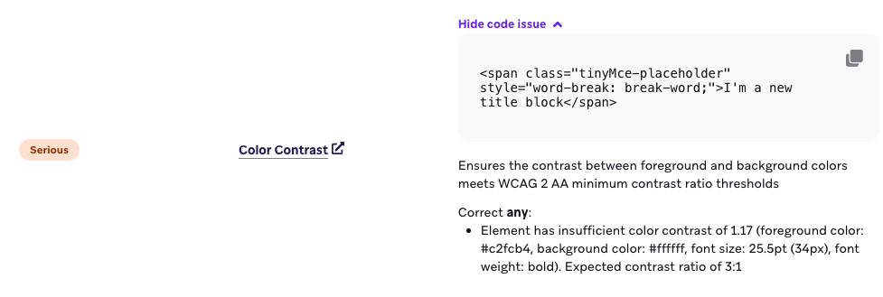
Color contrast is easy to fix but too often overlooked. Text, CTAs, images, and icons all need to meet color contrast requirements to remain readable. I recommend every brand check their colors for contrast using a color contrast checker (I love this one from WebAIM). You can also use Braze’s Preview & Test tab — it automatically flags contrast issues so you don’t miss them.
This is a very common pitfall! So many marketers want to just do image-only emails and think alt text can carry the accessibility criteria, but that’s totally false. Accessibility goes beyond screen readers; users with dyslexia, low vision, or color blindness need live text so they can adjust the size, color, or font.
Keep these tips in mind:
Live text boosts accessibility and helps deliverability, too.
Live text isn’t enough. You need logical structure.
Heading levels should describe the organizational importance of the content (like an outline of your content). Each idea deserves its own paragraph, not one long block of text. The good news: Braze makes this easier than most editors. You can set visual styling separately from heading levels, so your design stays intact without sacrificing semantic structure.
Braze also creates real paragraphs automatically when you add a hard return, which means no more dragging in extra paragraph blocks. (Many builders simply insert line breaks, resulting in one giant, inaccessible “super-paragraph.” Not great for assistive tech users.)
And if you use the basic list block in the Content tab, you’re building a fully semantic list by default. Add a line break, and Braze even creates a new list item for you - no extra work required. Small detail, big win for usability.
Clear hierarchy helps assistive tech make sense of your content, and makes emails easier on every reader’s eyes.
One of the best things you can do to improve the accessibility of your email is to reduce the total number of links you’re using. Yes, we want people to click our links, but that doesn’t mean that every single piece of content should be linked! Too many links frustrate users. Screen reader and keyboard users especially struggle when every line, image, or decorative item is clickable. Instead, focus your links to make your CTAs the stars. The bottom line? Link with intention.
And while we’re talking about intentional linking — make sure your link text makes sense out of context. An email full of “Learn more” or “Shop now!” is completely useless to many different kinds of users, so make sure your link text clearly describes the destination and purpose.
Bonus: The Braze Drag-and-Drop Editor even has the option to add an aria-label to your links which can help you give additional context to some users if you can’t use longer link text. Smarter links mean clearer navigation.
Alt text isn’t decoration — it's communication. I’ve got a whole deep dive on alt text where you can learn more than you ever thought possible about alt text, but the most important thing to know about alt text is to fill that text box in! Ask: “What is this image telling the user?” If the image links somewhere, say where. If it’s decorative, leave the alt field empty and don’t link the image.
Marketers love their GIFs to add flair, but they can cause issues for some users. To avoid causing harm (rather than delight), keep animations under 5 seconds, don’t loop them, and avoid flashing. This helps prevent users with ADHD, epilepsy, and some vestibular disorders from having negative interactions with your emails.
Dark mode support is another easy accessibility option, but unfortunately Braze’s drag-and-drop editor has limited native dark mode support, especially on Apple Mail and iOS. However, you can add a code snippet in your campaign or template Custom Head HTML to improve dark mode readability by inverting colors appropriately.
You can add the following code in your campaign’s setting tab (in the upper right hand corner) under the “Custom Head HTML” box. Note: If you do this in your template setting, you can set it and forget it! This snippet tells dark-mode–enabled devices to use white text on a dark gray background:
1<meta name="color-scheme" content="light dark">
2<meta name="supported-color-schemes" content="light dark">
3
4<style>
5  :root {
6    color-scheme: light dark;
7    supported-color-schemes: light dark;
8  }
9
10  @media (prefers-color-scheme: dark) {
11
12    /* Custom Dark Mode Font Colors */
13    h1, h2, p, ul, ol, li, span, b {
14      color: #ffffff !important;
15    }
16
17    body {
18      background-color: #2d2d2d;
19    }
20
21    .body, .nl-container, .column, .row, .row-2, .row-content {
22      background-color: #2d2d2d;
23    }
24  }
25</style>
It’s not a perfect fix, but it significantly improves readability in dark mode. Just make sure to test your emails in both light and dark modes across multiple clients to confirm everything displays as expected.
Zig-zag layouts (image on one side, text on the other) look sleek on desktop. But on mobile, everything stacks top to bottom, and that can create accessibility issues. If your image is on the right and you want it above the text on mobile, Braze’s “stack order on mobile” option lets you flip the order. However, this comes with a catch. It also changes how keyboard and screen reader users move through the content, which can make the email confusing to navigate.
For the most accessible experience, keep the natural stack order. It makes your message logical and consistent for everyone, even if it means letting go of the perfect zig-zag pattern on mobile.
VML (Vector Markup Language) can cause accessibility issues for screen readers in Outlook. The good news: background images in Braze’s drag-and-drop builder don’t use VML. The less good news: Braze’s CTA buttons rely on VML, even when you set the border radius to zero. My general advice is to avoid VML whenever possible, which makes this a bit of a sticking point. If you want a fully accessible workaround, you can add an HTML content block and build your CTA button without VML. It takes a little bit of coding, but it’s the best option for accessibility.
Most marketers don’t need to dive deep into code to build accessible emails — these small choices in Braze’s drag-and-drop editor go a long way.
If you remember nothing else, start here:
Accessibility isn’t about perfection; it’s about progress. And every improvement you make helps someone access your message who couldn’t before.
If something feels limiting in the builder, ask questions. Push the platform. Advocate for your users. That’s how accessibility standards get better — one thoughtful campaign and one committed marketer at a time.


.png)